Teaching Presentation
Responsive DesignGroup Project
Proximity
Definition:
Proximity is a design principle in dealing with logical grouping of information and objects. To pair things together that are related making things more organized for the ease of the user.Example:
 This page knows its users and caters to them. It logically groups together its source material and makes good use of the white space. Rotten tomatoes home page.
Alignment
Definition:
Alignment is the principle that makes a site either easy or hard to follow. Alignment has to do with the placement of different elements on a site. If a site has good alignment the user will be able to find content easily.Example:
 The Outbound is a good example of alignment. First, they have a navigation bar along the top which is easy to see, it makes it easy to find any content on the website. Second, the photos at the bottom follow a grid system which makes it easy to follow. Everything on the site is aligned well and site content is easy to follow and find.
Repetition
Definition:
Repetition: web pages and web sites need repetition to create unity, or a sense of oneness.Example:

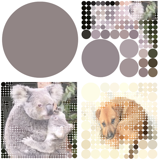
Here at koalastothemax.com, your screen starts out with a single dot. After mousing over that dot, four smaller cicles take it's place. Every time you mouse over a dot, it splits. This idea is repeated until a picture in the background is recognizable. Once every circle has split down to a very small one, a box appears at the bottom where you can enter the url of an image online. You then start all over with that picture as the background. This site is very consistant with its repeating divisions and is very easy to use and understand in a short amount of time.
picture taken from
Koalas to the MAXAnd with puppy picture
Contrast
Definition:
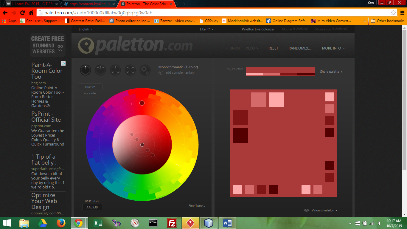
Contrast: is a mix of elements to stimulate attention.Example:
 Example: this site shows colors on a dark background to show contrast.
Typography
Definition:
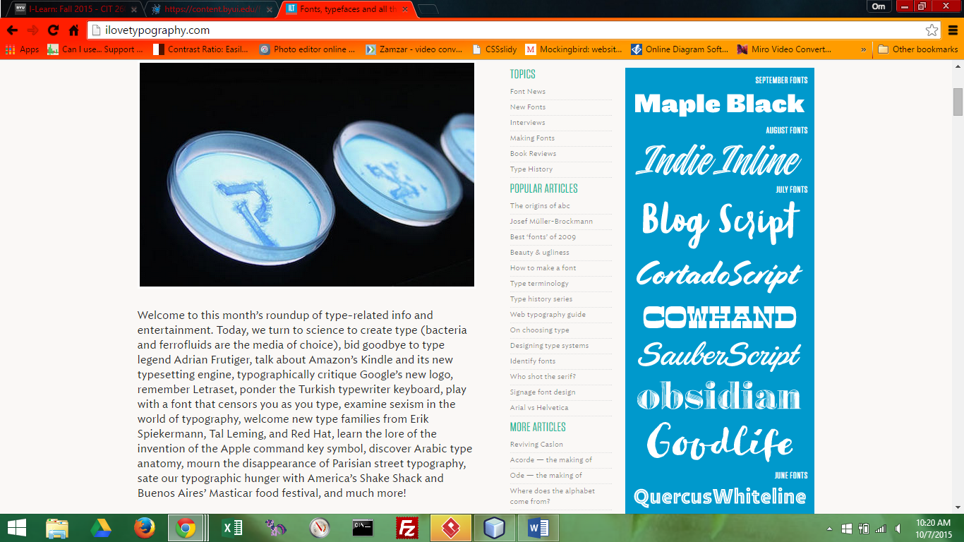
Typography: is the art, design and arrangement of the text.Example:
 Example: This is a good example of using text in different ways to show ascetics.
Team Members
- Dallin Barlow - Proximity
- Bree Carrick- Alignment
- Rj Brower - Repetition
- Brock Hodgson - Contrast
- Brock Hodgson - Typography